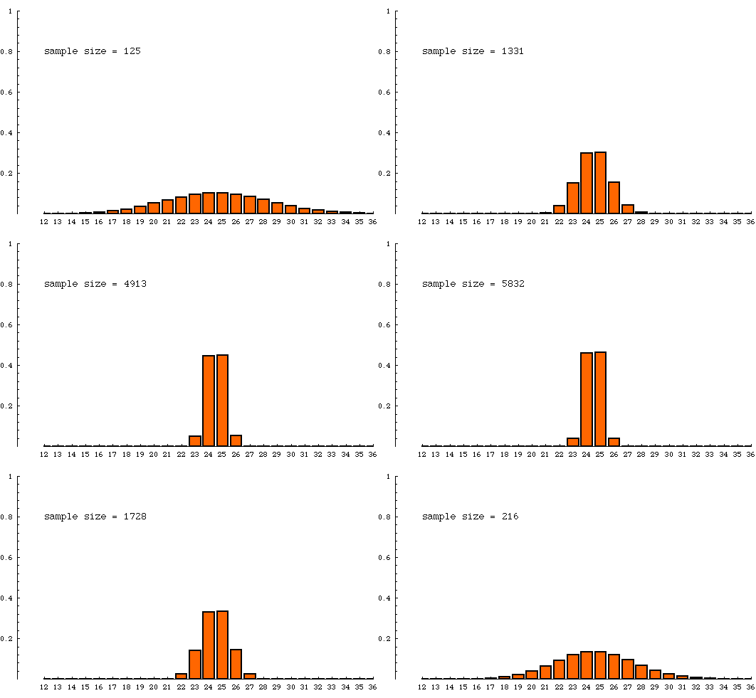
The animated bar graph below shows the theoretical sampling distribution for several different sample sizes. As the sample size increases, the distribution becomes more concentrated, agreeing with our intuition that larger samples tend to be more accurate.
The samples are all being drawn from a very very large population of units of which 25% have a distinguishing trait (are yellow, say). The numbers on the horizontal axis refer to percentage of yellow units in a sample. Samples with 25%--25.9999% yellow are counted in the column labeled "25". The height of a column is the probability that a sample (of indicated size) will contain the percentage yellow indicated at the bottom of that column. For example, when sample size is 8000, the column over "25" has a height of nearly 0.5. This means that a sample of size 8000 drawn from a population that is 25% yellow has a chance of nearly 1/2 of having between 25% and 26% yellow items in it. To put this another way,if billions and billions of samples of size 8000 were drawn from a jar of beads containing 25% yellow beads, then about half of those samples would have a percentage of yellow beads between 25 and 26. On the other hand, when the sample size is 125, only a small fraction (about 1/10) of the samples have a percentage of yellow beads between 25 and 26.

This page was made September 28, 1998 by Jim Madden, LSU.
Copyright information | Credits