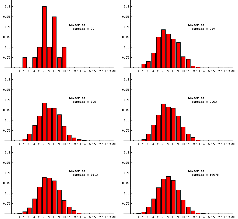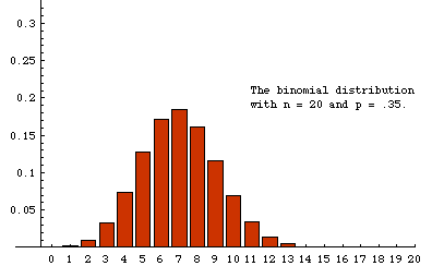

In the animation below, we illustrate some experimentally determined sampling distributions obtained when samples of size 20 are drawn randomly from a very large population---the population must be so large that removing a sample has essentially no effect on the proportion of reds---that is 35% red (and 65% some other color). The data used to make the animation were obtained from a simulation that ultimately drew nearly 20,000 samples. The animation shows the cumulative situation after 20, 45, 76, etc. samples. (There is a pause for 8 seconds on the last frame before the slide show repeats.)
The label at the bottom of each bar is the number of red units in a sample. The height of the bar over the label "n" is the fraction of samples in which the number of red units is n. For example, among the first 20 samples there was one sample that included only 2 red units, so 1/20 (=.05) of the samples contained two red units. In the last frame, we see that slightly less that .2 of the 19,675 samples recorded contained 7 reds. Although 7 is the most likely number of red units in a random sample, the probability of getting a sample with 6 red is nearly the same. Similarly, the probability of getting 8 reds is also very close to 1/5.
For comparison, the theoretical sampling distribution is shown on the right (or below, if your browser window is not wide enough). This is the distribution to which the experiment is expected to converge as more and more samples are taken. There are large aberrations when the number of samples is small. The animation shows how these fade away as more samples are accumulated. Some slight differences between the last experimental frame and the theoretical distribution can still be seen. For example, the experimental distribution of 19,675 samples shows a slightly higher percentage of 14's and a slightly lower percentage of 13's than the theoretical limit. Such aberrations would fade away almost completely if the number of samples were allowed to continue growing.


For a nice Java applet that illustrates the idea here with different graphics, look at More java stuff: the normal approximation of the binomial distribution, which is on Berrie's Statistics Page, a site in the Netherlands.
This page was made September 27, 1998 by Jim Madden, LSU.
Copyright information | Credits